After having used the old dashboard a couple of events Telia contacted me if I could create a new one, and that I could. This time I got my friend from previous adventures on this blog, Mr Hannes. His master knowlege about design and UX combined with my backend expertese led us to a novel setup.
Insted of only using one screen we wanted to give the dashboard more impact and show more stuff larger. After coming up with a couple of new ideas we finally went with splitting the dashboard into several screens. Since the there was four racks for the servers, and the width of a rack was almost exacly the same as the hight of the TV we used, we rotated them 90 degrees. The dashboards we created needed to be usable in horizontal mode also, since most (all?) of the people who viewed them via the web had horizontal screens.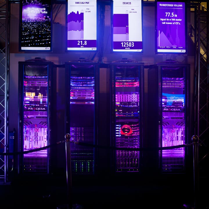
With all the extra space we decided that we could afford to use one of the screens for branding only. So the left-most screen contained no data, only a clear Telia branding with an image and slogan they use elsewhere. On the other three screens we show the number of devices on the network, the current throughput from the three main halls and the accumalitive data volume as a stack of CDs compared to different well known buildings from around the world.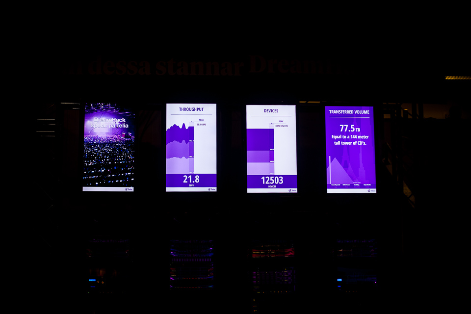
Steer your browser towards https://dhdashboard.se/ during an event and you’ll be able to see the dashboard in person.