The Telia Dashboard for Dreamhack started to feel a bit dated so Hannes and I started thinking of doing a new dashboard, but in a different way. We brainstormed all the possible metrics at DH that we could visualize, everything from traffic in the network to how many cans of soda had been sold and the distribution between sexes regarding shower-count.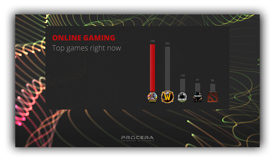
Since we din’t have a lot of time we had to cut down on what data we were to collect, we ended up with seven (expanded to eight during the last event).
Total traffic
The accumulated traffic amount in bytes (or rather terrabytes) from the event start.
Bandwidth usage
The current throughput through the Procera PREs, updated every second to get live graphs. It peaked at around 20Gbit/s usage of the availible 40Gbit/s
Connected devices count
The number of unique IP-adresses seen during the event, using the Procera PIC statistics.
Top games
The number of connections per game, classified by the Procera PRE. We use the Python API to connect to the PRE every second and get the number of connections.
Gameplay time
The accumulated time for all games, this ended up near 4000 days. This is a feature of the Procera PIC.
DHTV viewers
This uses the Twitch-api and a list of official streams to periodically connect and retrieve the viewer count of each stream and summarize them.
WIFI-clients
Thanks to STKJ and Phivil we got SNMP access to the Cisco WIFI gear and could get accuarate client count every second.
Dreamhack Game players
After a request from the Dreamhack Game guys we created a special rule in the Procera PRE to count the number of visitors to DHGames website and publish this.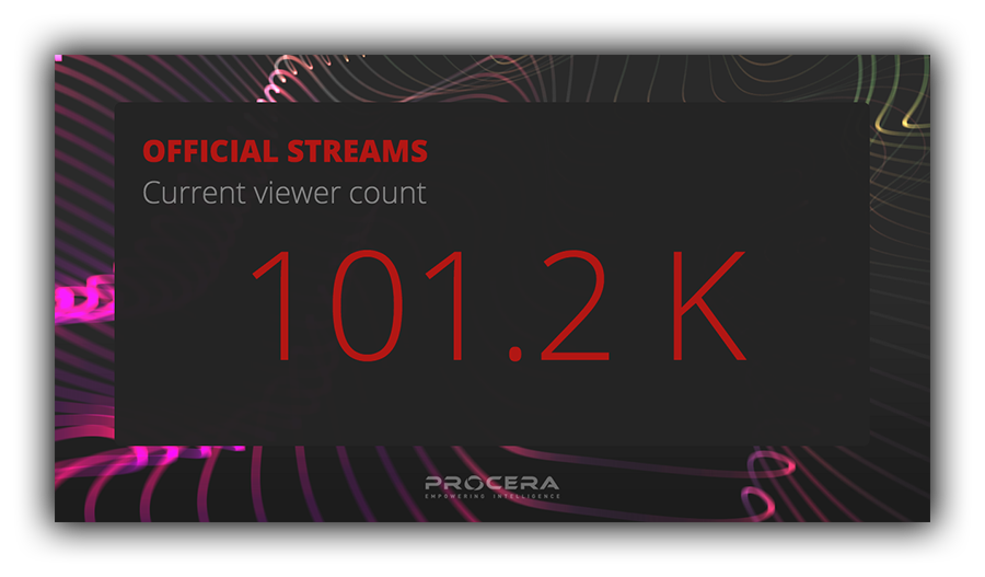
For the visuals we decided early that we wanted something flashy using WebGL, it did’t take long until we settled on a GL background and cards in the foreground that flipped horizontally when switching between the content of the cards. For the background we started with falling cubes with a nice DOF falloff. But it didn’t really work, so we tried out other thing and finally settled on the wavy background that is in the final version.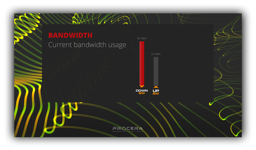
During the event we came up with some ideas for future improvements. One problem is that some of the numbers are interpretations of reality, like Connected devices, so for those items we’ll investigate other (better?) metrics to use to represent that data. Also the most requested feature was more linegraphs, so we’ll look into how we can incorporate that into the current design.