While I lived in an apartment and was stuck with getting internet via some one DOCSIS5 connection over damp cottonthread I grew more and more irritated that I didn’t get the bandwidth i payed for. But, DATA > DOGMA, so created an experiment to collaborate my feelings.
I started to ping the first router outside my own network every 30 seconds and record the RTT min, avg and max. At the same time I recorded the inbound and outbound bandwidth usage.
To visualize the problem I started with filtering out all data points where the inbound traffic was greater than 20% of the promised capacity. Then I plotted the resulting data on a graph with Outbound bandwidth on the X axis and RTT on the Y axis. I also added the number of samples as the background and a line for average packet loss.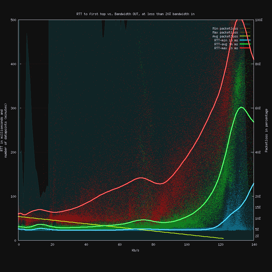
Each RTT sample is a red, green, or blur point in the graph, and the lines is the average. As you can see, at about 100Kb/s the RTT starts to climb and already at 120Kb/s it’s has a quite large impact.
My conclusion was that the site i was connected to (or it’s upstream) was heavily overbooked and saturated. The good news was that FTTH was promised any month, and after a year or so it was installed. And to compare I did a new graph of the data since I had fiber, and it looked dramatically different.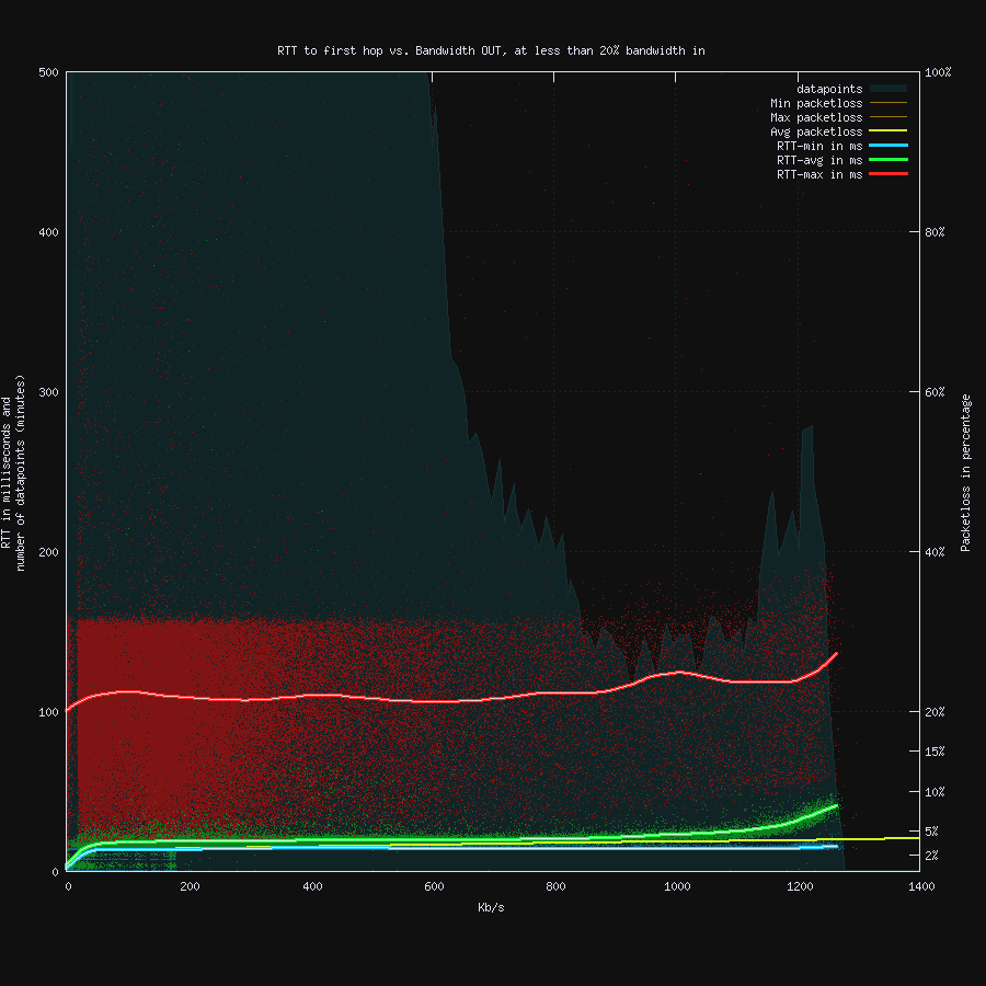
You can see that the RTT are almost flat all the way to the end, and that my connection was limited by the speed I payed for, not the ISP network.
The slight bend at the end could be due to limitations in the hardware I used as my gateway.